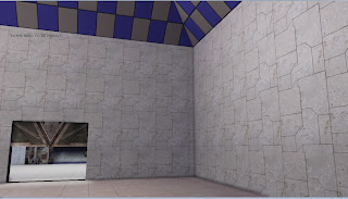
Monday 21 November 2011

After More Research!

After doing some digging around on the internet looking at different architectural styles, I think I can say that the style of my buildings and designs, most closely resemble that of  the "Brutalist" style, which is described in "http://www.saylor.org/site/wp-content/uploads/2011/05/Brutalist-architecture.pdf" as

"Brutalist buildings usually are formed with striking repetitive angular
geometries"
"A building may achieve its Brutalist quality through a rough, blocky appearance, and
the expression of its structural materials, forms, and (in some cases)
services on its exterior."

 taking info from another Blog: http://rhanvintage.blogspot.com/2010/11/brutalist-architecture-and-its.html
"So what do Brutalist buildings look like?  They share repetitive angular lines, and are typically made with concrete, though you will also recognize this style through the use of rough, blocky shapes and exposed materials and forms"


Looking at some examples around i think this quite closely fits my style, and is likely something i may try and enhance in my work, to push that style a bit more.

http://farm1.static.flickr.com/64/152860690_4860f7999f.jpg< I want to live here
http://www.ontarioarchitecture.com/Bruttor.jpg


some of the examples here are really incredible:
http://www.flickr.com/photos/30927593@N03/galleries/72157622252509389/


Edit: http://www.saylor.org/site/wp-content/uploads/2011/05/Brutalist-architecture.pdf
is almost word-for-word the same as wikipedia, and the pictures seem to be linked from wikipedia, strange...

Some comments on the style

Not having a background in traditional art, I struggle talking about specific styles but I’ll do my best to do so without embarrassing myself.


What i wanted to do, in order to both produce a specific and coherent visual aesthetic, as well as making my own life easier, I chose to limit my colour palette to 3 main colours: Cream/Grey, Bronze, and Black.


What i wanted to achieve when using these colours, was to create a game that avoided looking like what someone would expect from a UDK game, muddy browns etc.
http://trekweb.com/images/stories/4998d31969b30-1.jpg

I wanted to create the feel of a science complex in the future, but leaning towards a more industrial rather than the clean, smooth style that you could see in say, the interior of the enterprise from startrek, or the view of the future painted in the 1940's-60's


http://technabob.com/blog/wp-content/uploads/2010/02/pyramid_casemod.jpgAfter some thinking, I worked out that both the shapes and to a lesser extent the colours, were inspired slightly by Stargate, and the egyptian-styled alien ships there, as they use alot of geometric shapes in the architecture. (unfortunately it's apparently very hard to find any really clear pictures of it on the interwebs)

  http://www.rainbeau.net/design/sggoauldhall1.jpg


Taking Advice

This was one of the doors made for the first room, set directly into the wall.
After showing it to John, he suggested putting it in a frame.
I took the same shape which makes up the focus of the door, and applied it to the frame to break up the block colour, as well as enhance the the visual impact.

FBX import issues

A Problem I've been experiencing is when using FBX format.
Generally when combining multiple objects, or seemingly when saving-closing Maya- then reopening.
what would happen is that any sections that were created via duplication would completely lose their UVs:
 The image here, has the same material  on everything, yet parts of it are showing up white.
This is because their UVs have disappeared completely...
after spending many days, of reopening the FBX, re UVing etc, I couldn't work out what the exact cause of the issue was, so in the end I had the model as separate objects, then selected the whole thing, and exported as OBJ, which seems to have fixed it.

Wednesday 26 October 2011

runthrough of the level so far


This is a runthrough of the level as it is so far, with default BSP textures, and placeholders.

here are a couple of screenshots of the custom materials made so far for the level

 Tiled Floor.


attempting to make a slightly more complex tiling pattern.

A "mood board" if you will

I really like this film, i love the "tint" that the shots have that give it a hint of sepia.

Transformers from repey815 on Vimeo.


the transition from inside to outside, and the lighting effect it creates it what I like here.
  The artificial lighting here, and the way it's organised, but incomplete is why i chose this.


These three really just aim to show the overall "feel" of the set i want to make

The concept for the level

The setting/feel I want to get from the level is that this is/was a medical style facility, hidden away underground in the wilderness.
The facility has long been void of humans, but the robot's that run the place have continued on with their routines as normal, leaving the place to start to deteriorate.


The way the level will flow consists of an opening first person cut scene, where the play regains consciousness; with blurred vision, and head spinning, the character stands up, and regains her composure, giving the player control.

The first room is sterile, and empty aside from the steel bed, and a door.

Moving forward into the next room, i want to have 2 robots just finishing that they were doing and moving into their pods to shut down. leaving the player to wander through the room, to a set of large blast doors.

Either automatically as the player walks up to them, or via using a console, the doors will open, leading to a lift, which takes the player up to "ground level"

Ground level will be a long corridor, with the end open to the outside, which will be a wooded/overgrown area.


Setting the level out this way will allow me to experiment with matinee through the opening cutscene, as well as working with triggers for the doors, lifts etc.
having the outside section will allow to me try out the new foliage tools, as well as the new lighting mechanics from the day/night cycle.

Hopefully this will let me get aquainted with the UDK so when the final project comes about, i'll be less paralyzed by the fact we've done very little in game stuff so far.